Brand guidelines
Everything you need to talk about TAG — logo, colors, type and how we sound. For partners, press and builders.
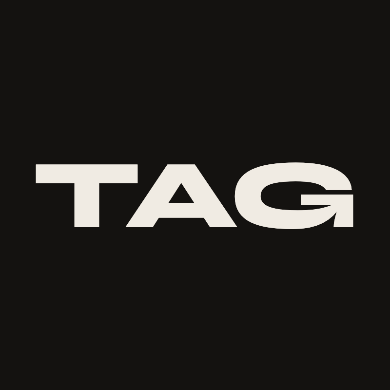
Logo
Use the wordmark in full. Keep clearspace around it equal to the height of the T, and never recolor or stretch.
Avatar
The square mark for profile pictures and social avatars. Use as-is — keep the full frame and don't crop the wordmark.
Color palette
Orange is the accent — used sparingly. Everything else lives in warm dark neutrals. Tap any swatch to copy the hex.
Typography
Three voices: Syne for display moments, Space Grotesk for everything readable, Space Mono for labels and small caps.
To Achieve Greatness
A community of builders, hackers, and creators in Amsterdam. We ship every month — then we do it again.
EVENTS · SPACE · ECOSYSTEM · JOIN
How we sound
Direct. We don't hedge. If something ships, we say it shipped. If something broke, we say it broke. Short sentences beat long ones.
Builder-first. We talk to people who make things. Less marketing, more workshop. Concrete verbs over abstract nouns.
Warm, not corporate. Obsessed, creative, talented — the words we use for our people. We celebrate the work, not the titles.